In the Beginning 2000
Email message from Rochele Altman to Scott Meyer
September 6, 2004
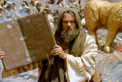
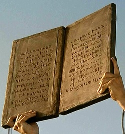
Squared in accordance with midrash, I see... script seems to be some type of Paleo. So neatly presented; nice large margin at the top... which is quite wrong for an ancient tablet or stele -- even tabula... but quite right for the renaissance for a tabula... imitation tabula all right, only tabula were made of wood filled with wax and had a size range of ca. 8 x 5-1/2. Size and shape meant disposable material, entertainment, erasable. Not a good guess for shape and size at all. They got the block format right, though.
July 22 2005
It's a conglomerate of paleo. It' includes graphs from the earliest North-Semitic dalets (triangles) and ayin ("O") to the 8th-7th century lameds and hehs.
Look at the line just above the index finger.... starts with the "O" type ayin... has a triangle dalet and an early shin ('W") on the same line. Next line down has the "backwards capital E" type heh. And so on. Those series of straight lines between commands and at the end of a line are just fillers -- these folks realized that the text had to be block, with no room left for forged insertions.
I can't imagine why he [art director Alistair Kay] thought it wasn't paleo...
Cuneiform always has the "serif" at the beginning of each stroke (and has very different graphs from paleo). Look at formal square script. The wedge plus straight line on each beginning stroke imitates the cuneiform wedge plus straight line that necessarily follows from the tool used to inscribe cuneiform in wet clay. I have several paragraphs on this on pages 3-4 in my book.
Depending upon time period, actual paleo texts are written in a continuous stream or with dots between words. They do not use fillers of any sort -- words are "broken" at a syllable and just continue on the next line down.
September 6, 2004
Squared in accordance with midrash, I see... script seems to be some type of Paleo. So neatly presented; nice large margin at the top... which is quite wrong for an ancient tablet or stele -- even tabula... but quite right for the renaissance for a tabula... imitation tabula all right, only tabula were made of wood filled with wax and had a size range of ca. 8 x 5-1/2. Size and shape meant disposable material, entertainment, erasable. Not a good guess for shape and size at all. They got the block format right, though.
July 22 2005
It's a conglomerate of paleo. It' includes graphs from the earliest North-Semitic dalets (triangles) and ayin ("O") to the 8th-7th century lameds and hehs.
Look at the line just above the index finger.... starts with the "O" type ayin... has a triangle dalet and an early shin ('W") on the same line. Next line down has the "backwards capital E" type heh. And so on. Those series of straight lines between commands and at the end of a line are just fillers -- these folks realized that the text had to be block, with no room left for forged insertions.
I can't imagine why he [art director Alistair Kay] thought it wasn't paleo...
Cuneiform always has the "serif" at the beginning of each stroke (and has very different graphs from paleo). Look at formal square script. The wedge plus straight line on each beginning stroke imitates the cuneiform wedge plus straight line that necessarily follows from the tool used to inscribe cuneiform in wet clay. I have several paragraphs on this on pages 3-4 in my book.
Depending upon time period, actual paleo texts are written in a continuous stream or with dots between words. They do not use fillers of any sort -- words are "broken" at a syllable and just continue on the next line down.
